Case study // Personal project, no NDA, all mine
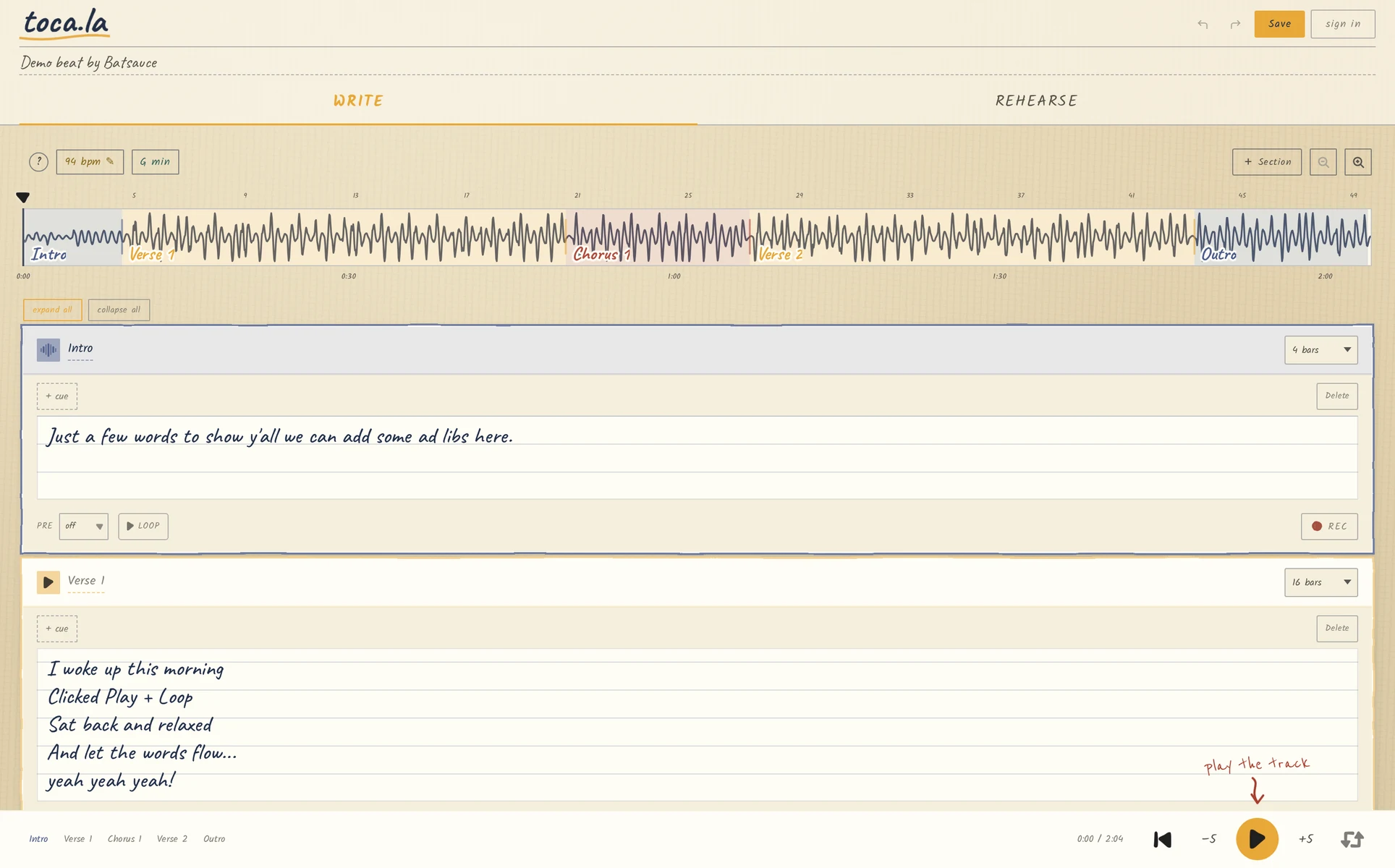
toca.la is the songwriter's studio I always wished existed. My producer sends me a beat, and instead of juggling three apps and losing lyrics halfway through the second verse, I open one browser tab. Load any audio file and toca.la detects the BPM and key, maps your song into sections, and gives you a lyric pad synced to playback.
toca.la started as a personal frustration.
When writing lyrics, I need to hear the beat, on repeat, but not the whole song. I want JUST the part I'm writing to so I can stay in the zone, WITHOUT having to scrub the beat back to a certain point. I've had this idea brewing for some time now, but never had the dev skills to bring it to life.
I decided to ask Claude. 
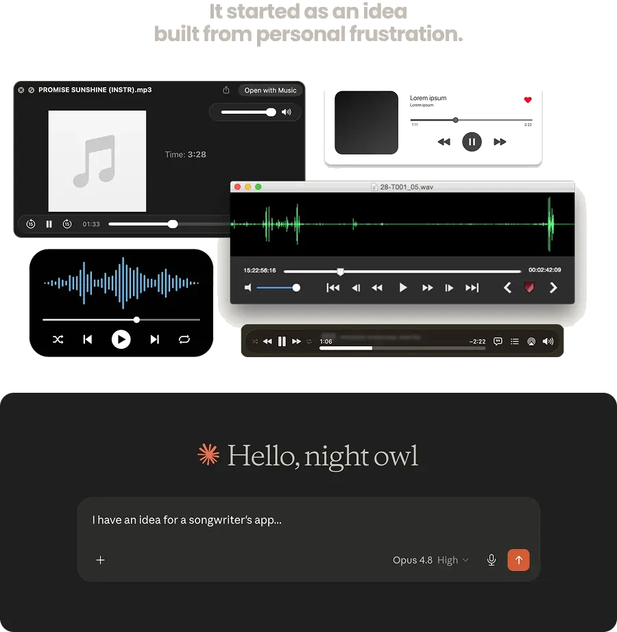
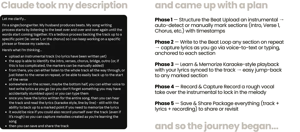
I told Claude my idea. I shared my frustrations with the current songwriting workflow, and suggested my potential solution. Not knowing what to expect, I was surprised to see a well-thought out and logically phased development plan.
I imagined it would just blindly generate a first pass, but I realized Claude is more like a co-worker, strategizing the plan of attack before making it's first move.
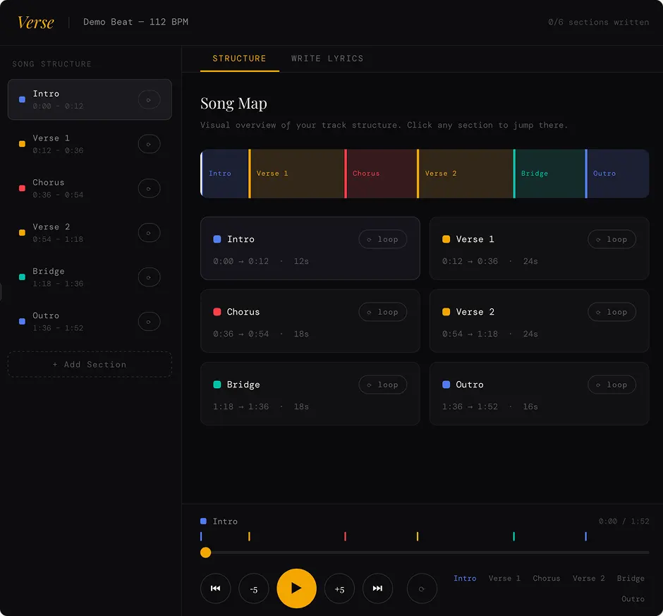
The first iteration was pretty amazing, but it was just a static page. Claude walked me through installing Node.js, creating a React app and getting my local environment set up so I could use the Web Audio API to handle audio uploads, playing, looping. etc.
From this point on, Claude would generate an App.js script which worked on my localhost. I could now upload a track and hear audio in my browser, as well as mirrored to my phone.
Now it was time to refine.
It started as evenly-sized section blocks, structure with no relationship to the audio itself. Adding a waveform tied the map to the actual sound, and draggable edges let writers shape sections by feel instead of by guessing.
I also added BPM, key, the ability to add sections, and a way to zoom in/out of the waveform for precision tracking, including mouse and trackpad gestures. These were all usability enhancements discovered as I was playing with the application in real time.

Equal-width blocks. Every section looks the same length regardless of the music. The map and the audio felt disconnected.
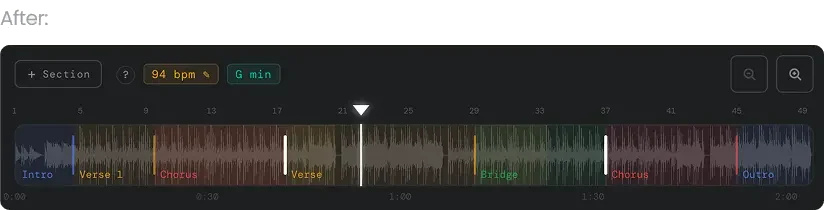
Widths now track real duration, a waveform sits behind each section, and draggable edges (the handles) reshape boundaries inline.
Section cards under the timeline were originally laid out in a two-column grid. On a phone, where most writing happens, that meant cramped cards and tiny tap targets. Collapsing to a single column gave each section room to breathe and a clear, scannable vertical order that matches the song top-to-bottom.
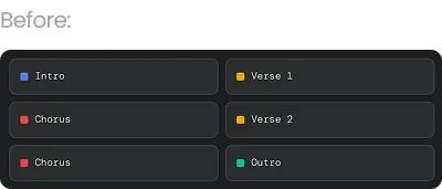
Two columns. The reading order zig-zags and cards were squeezed... awkward on a phone.
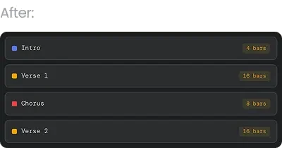
One column, straight top-to-bottom like the song. Full-width cards, comfortable tap targets, room for metadata.
Hooray for that!
The biggest simplification.
Originally writers toggled between a Structure tab and a Write tab, but a songwriter doesn't think "I'm in structure mode," they think "I'm working on my chorus." The section is the unit of work, so structure and lyrics were merged into a single card. The two-tab model then sharpened into a cleaner mental distinction: Write vs Rehearse.
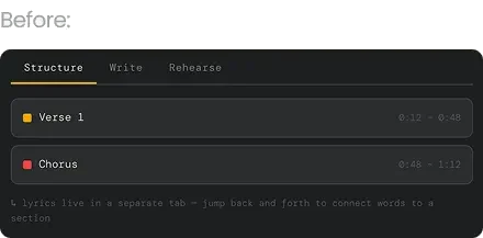
Structure and writing split across two tabs. Context-switching broke the flow of actually writing to a section.
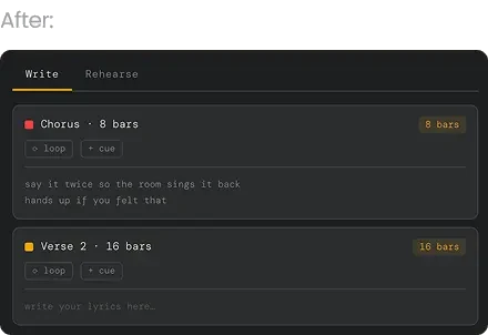
One card owns the whole section: structure + lyrics + loop + cues together. Tabs collapse to Write vs Rehearse.
Sections were originally measured in seconds and timestamps, the language of a video editor, not a songwriter. Switching to bars matched how musicians actually think about song length.
Tapping the bar count edits the section length directly, moving the divider and the next section's boundary together, which quietly replaced the need to drag timeline dividers by hand.
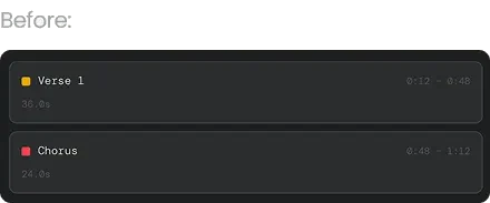
Length shown in seconds and timestamps. 36 seconds tells a songwriter nothing about how long the verse feels.
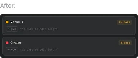
Length shown in bars, the unit musicians count in. The amber pill is tappable, so editing bars resizes the section without dragging.
Which turned out to be the useful part.
Everything above got the app to working. It was dark, competent, and it did the job. I used it, showed it around, and then left it alone for a few months.
Coming back to it cold, the problem was obvious in a way it never is when you're inside the file every day. It looked like software. Dark chrome, glowing accents, a control surface. It looked like the DAW sitting open in the next window, and that is exactly what a songwriter is trying to get away from when they open a notebook.
Nobody writes their best verse inside a mixing console. They write it on paper, in a margin, on the back of something.
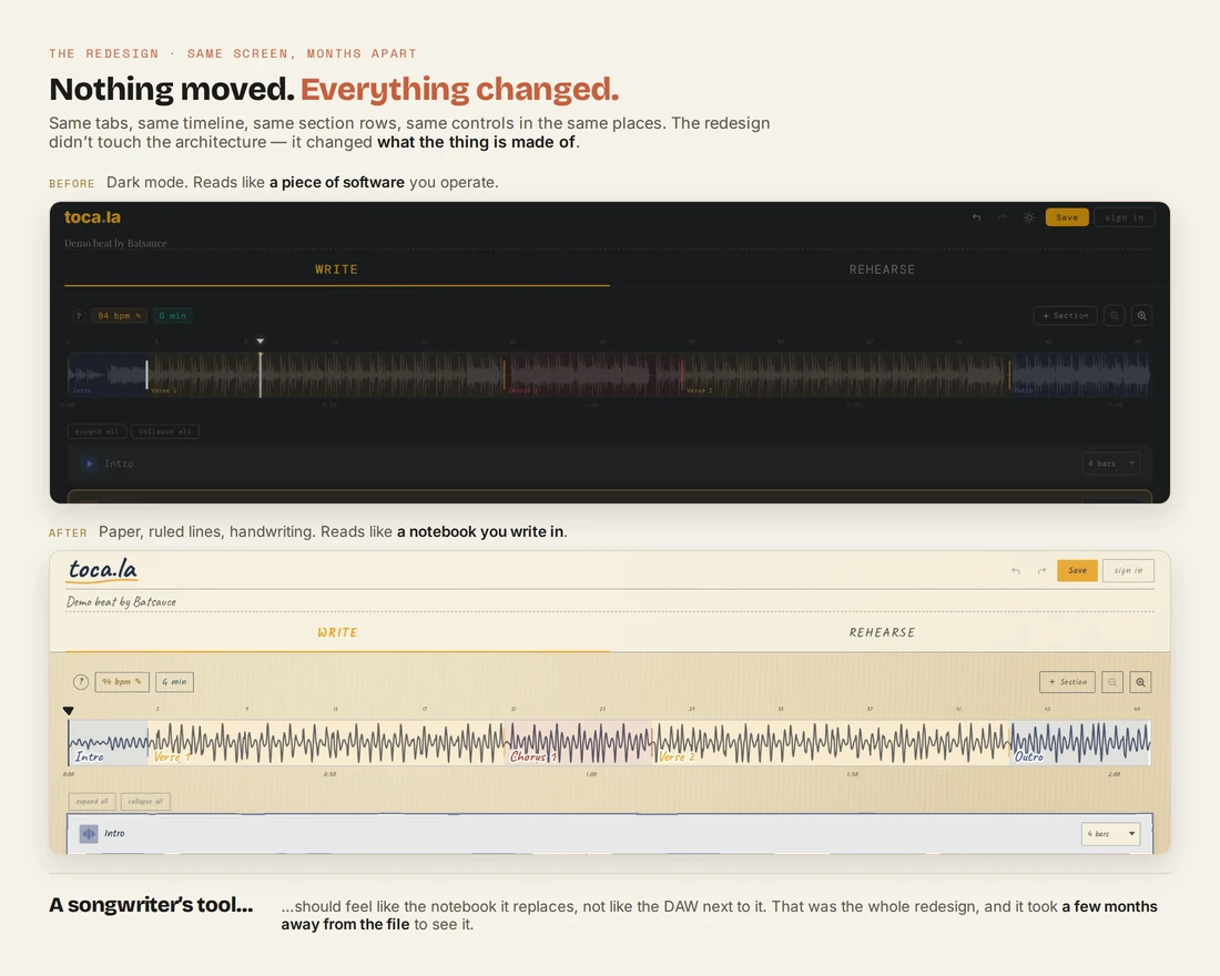
So I rebuilt the surface as a journal: warm paper stock, ruled lines under the lyrics, handwriting for anything a person would have written by hand, typewriter type for anything the machine says, tape and notebook spirals holding the pieces down.
Not one control moved. Same two tabs, same timeline, same section rows, same transport. The information architecture I'd spent all those iterations getting right was already right. The redesign only changed what it was made of, and it changed how the whole thing feels to sit in front of.
The lyric pad is where the change earns its keep. Same field, same prompt, same placement — but one of them is a text input and the other is a page you write on.

A dark input box. Functional, and it reads as a form waiting to be filled in.

Ruled paper and a handwriting face. Same words, but it reads as an invitation to start writing.
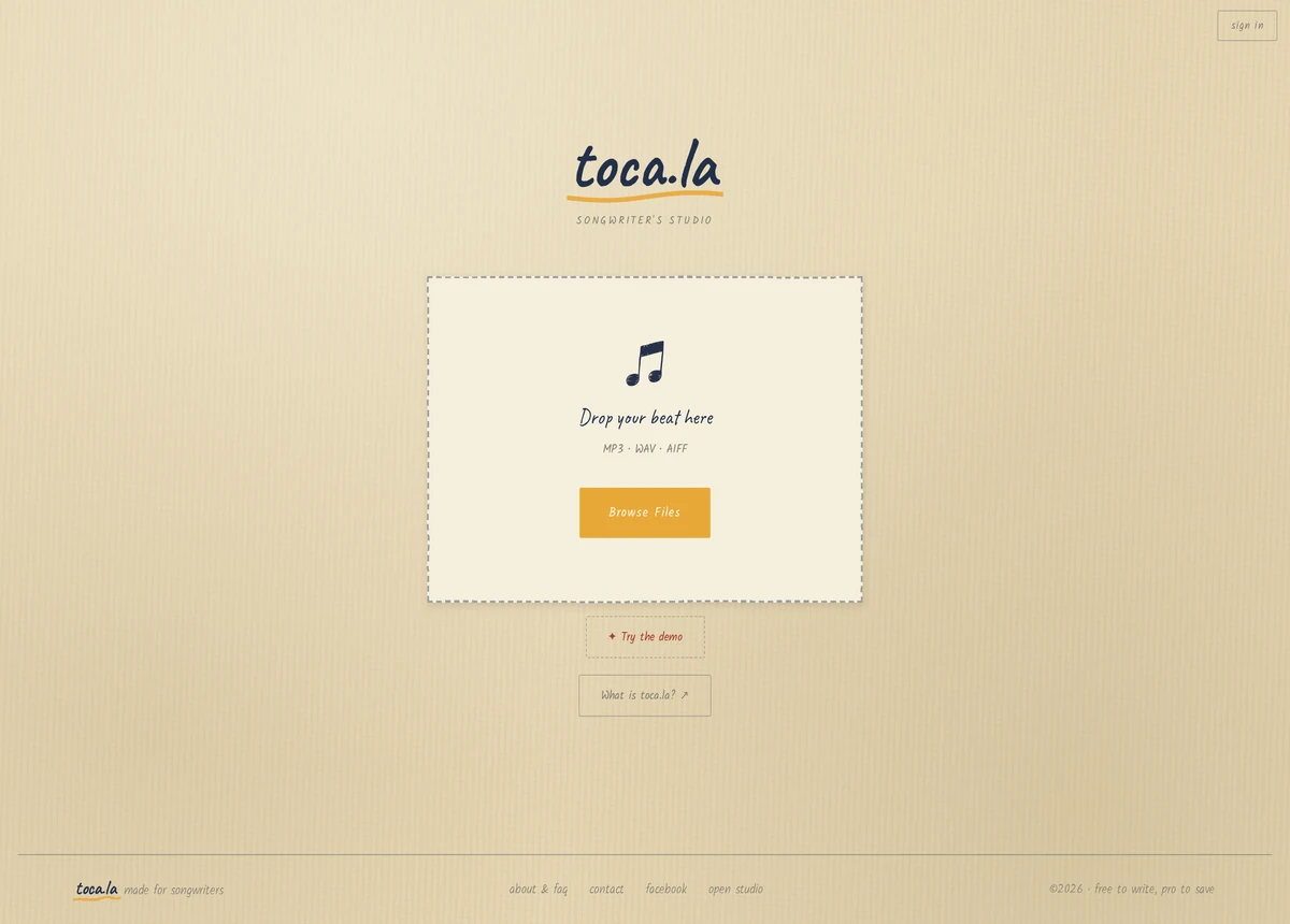
The first screen asks for exactly one thing. Drop a beat, or tap the demo. No account, no tour, no empty dashboard — the fastest route to the only moment that matters, which is a track loaded and a cursor blinking on a blank line.
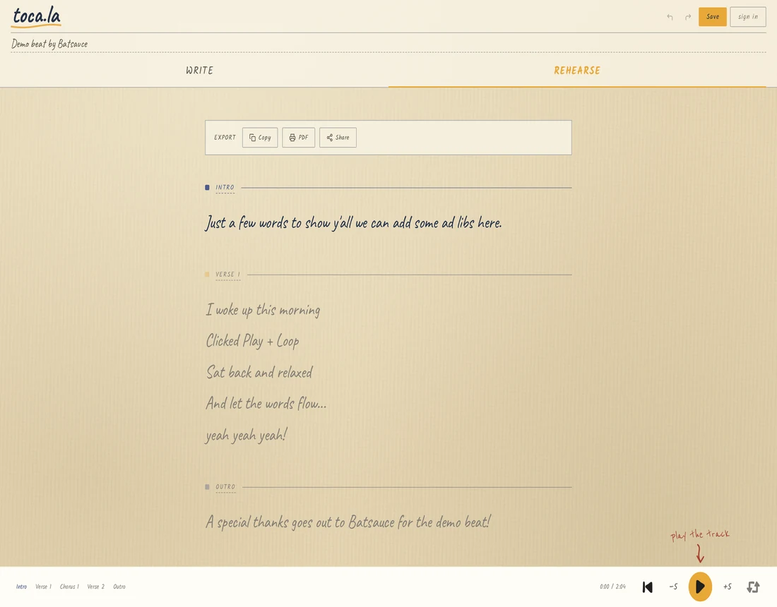
At the other end, Rehearse strips the tooling away and leaves the lyric sheet: the words, in order, big enough to sing from, with the beat still playing underneath. Copy it, print it to PDF, or share it.
Write and Rehearse are the same song wearing the two faces a songwriter actually needs: the messy one you work in, and the clean one you perform from.
Where it landed
From a single idea to a working, browser-based songwriter's studio: conceived, branded, designed, and built solo through an AI-native workflow.
Proof, in a shippable product, that one designer plus AI can carry something all the way from concept to launch — and then, months later, have the distance to tear the surface off and rebuild it when it turned out to feel like the wrong kind of tool.
It's live and free to try. Getting it in front of songwriters is the part I haven't done yet, and I'd rather say that plainly than dress it up. Building the thing was never the hard part.
toca.la is live and playable in the browser, and so is let's bloom together, my other public project. The rest of my case studies are password-protected to respect client confidentiality.